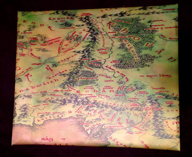
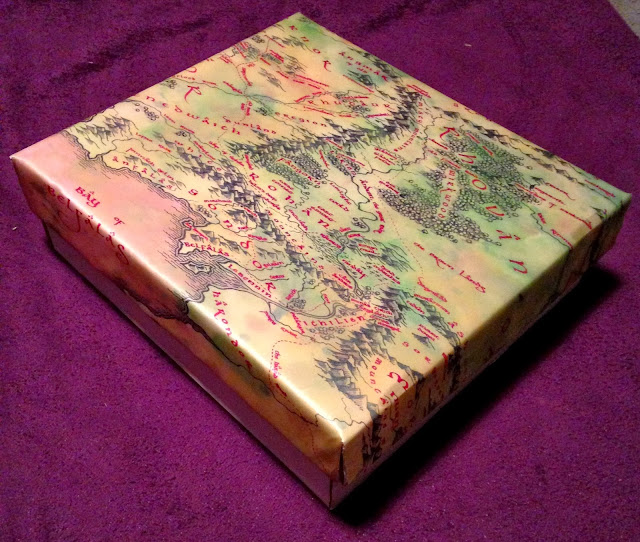
To begin with, I bought a four tiered white cardboard box (this is the plain box I mentioned above) but to spice it up, I carefully cut out a silk map of Middle-earth that I purchased for around $6.00 on eBay and taped it to the lid of the box, wrapping it around to the inside as well.
 |
| Top of Box Lid |
 |
| Side View of Box Lid |
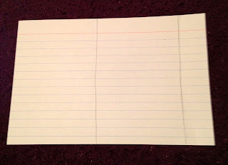
Afterwards, it was time to customize the inside of the box lid. I made a small pocket using note cards that ran the length of the lid and placed the remainder of the silk map over this. This pocket is now used to hold all the instruction booklets for the game.
 |
| Interior of Box Lid |
Now that the box lid was good to go, it was time to devise unique dividers for the cards themselves. For the first several months, I had written out dividers for each category, but they had become very tattered and were looking rather bad; so, I decided to design new ones that would last.
First off, I wanted the text on each divider to be a Lord of the Rings font. So, I made my way to The Hutt's Realm Tolkien Fonts webpage (http://www.thehutt.de/tolkien/fonts.html) and downloaded several fonts to test out in Microsoft Word. The one I ultimately chose was Aniron.
Upon typing out each title for the dividers, it was important to get the sizing right on each each one, as some titles are short (such as Core Set) and other titles are not so short (such as The Watcher in the Water). Sizing did take trial and error, but here is a link to the Word document containing all of the text: (https://drive.google.com/file/d/0B4b3LJQBi1Zdd3Y2cHppeUs2SWs/edit?usp=sharing)
*Note* The Aniron font will not show up on the view only version of this; however, if you download the file as well as the font itself from the above webpage, it should work!
The project was now ready to get started on. The supplies I used were a pack of 3x5 note cards, a glue stick, a pack of penny sleeves, and a pair of scissors.
Now it was time to get these titles off the pages and onto dividers. So, to begin with, I carefully sized each one to fit on the top of a note card. This note card was measured to fit precisely into a Ultra Pro penny sleeve.
Once I had the right dimensions of a note card that would fit snuggly into a penny sleeve, I used it to make to additional cards on each 3x5 note card.
Next, cut along the lines that were just drawn to create two separate note cards. Glue each of these together with the lines facing one another (so that only the clear part of the note card is visible on each side.)
Now the card is ready to have the unique titles applied to them, so after printing them off, carefully cut out each one and glue it to the top of either side of the double-sided note card.
And finally, all that's left to do is fit the card sleeve into the penny sleeve, with the text going in first. The bottom portion of the note card will extend out of the penny sleeve about 1/2 inch, but this is important for making it taller than the rest of your cards. The reason I went to the trouble of making these dividers double sided was to add to the strength and stability of them, as they are constantly being moved and adjusted within the game box.

I was very pleased with the end result of this project! Now I can choose my heroes, player cards, and which quests to embark upon with style (and an increased level of support and durability!)
 |
| One of my new favorite quests! |


Looks great!
ReplyDeleteThank you! Organized storage can quickly become a challenge when you build a collection like this, so it's important to get a method down sooner rather than later.
ReplyDelete